Friday, 21 May 2010
Meeting Record
-> The Bath Film Office
http://visitbath.co.uk/site/media/filming-in-bath
"The Bath Film Office promotes and assists film-making in Bath & North East Somerset to ensure that your shoot runs as smoothly as possible." The Bath Film Office came to issue us a brief which we had to forfill.
-> Suited and Booted
http://www.suitedandbooted.org/
Suited and Booted came to assist and mentor us in the process making our films as some of us weren't entirely capable in understanding the uses and functions of filming camera equiptment.
-> The brief we were given
The brief we where given was to make a short 'Gothic" themed film utilising Baths main attracions and scenery. Now being as bath is a well known tourist attraction this was a hard choice because we wanted to use a lot of "hot spots" but hush hour times, people, traffic and equiptment was not always availible, all this caused 'hitches and set backs'. At first we were all corcious but yet still curious, like we didn't want to throw our selves into the deep end but at the same time we all stil wanted to experiment and make sure we use what we believe to be the best places for our films to be 'the best'.
-> Bath Film Office's involvement
they came in periodically to check on our progress and gave suggestions, they helped by answering our questions and queries on any uncertancies that any of us had. they even gave us obvious solutions to minor problems that we could see for ourselves!
-> Suited and Booteds' involvement
they went through the general knowledge, terminologies and key functions of the camera equiptment. gave us quick tips and tricks that we couold incorporate and uitilise.
-> my personal ideas and involvement
the camera angles used, keeping the group motivated and bubbly when i was present, bringing a bit of everyones ideas together. in a way i took up the role of becoming like the "mother hen!", i allocated differnt roles and jobs to each group member.
-> personal questions i asked The Bath Film Office
Do you know what i really can't remember right about now but they were purposeful and valid at the time.. i like to interpret what someone has mentioned and then question it making tthe person elaborate further. Bring the question to the forefront and then making it become a topic instead and go into depth.
-> personal questions i asked 'Suited and Booted'
What interested them?
why did they do that job was it an actual passion or a 9-5?
did they work hard and struggle to get to the position they are at now or did they just apply for a job and waa hayy?
Tuesday, 27 April 2010
=] this recycling project
College.
1) Different buildings of the college could recycle, this would be measured for a testing period of 1 term and prizes/ gifts would be issued at the end. pries and gifts would be an incentive.
2) Better, clearer (colour coded) signage for recycling.
3) Formal information written inn the next prospectus
4) Set up a partnership with other colleges or a company to help more sufficient flow of recycling or maybe they as a partnership would use, benefit or utilise our "waste".
5) Sell the old computers that our college no-longer use.
-> possibly to en-rolling students
-> staff
-> Or donate them to other companies, schools.
6) Raise an awareness of our college, the ethics made and brought to attention.
-> Maybe the mondasy of each week could be highlighted and focused on more deeply along with the general recycling done.
an information sheet was issued to us on behalf of Lisa, a member of staff at our college informing us that this week was the week to focus on the enviroment during Green Office Week. they had subheading to focus on each day of the week (baring the week-end).
MONDAY- make a start Monday"
TUESDAY- "Choose right Tuesday"
WEDNESDAY- "Waste not Wednesday"
THURSDAY- "think a head Thursday"
FRIDAY- "feel good Friday"
7) seek out the problems and issues that may arise and the college may be facing at present, then think of ways to overcome and solve them.
jadine.
Friday, 23 April 2010
The Bristol Children's Scrapstore
The layout is relevant to the viewer because the colours tones (purples, pinks, blues, with a white background and splashes of paint) children, young teens, youths in general. I feel as though this was done to draw in the younger audience get there attention to then make them want to read on and become more aware of this company, it's purpose, facilities, cause, and perhaps join, support or submit something in some way shape or form.
Full detailed information is given to then allow the reader to have a fully bodied intake and view to make a good judgement (11 icons, of hyperlinks).
i love the fact the the company utilises its resources to the full and helps other companies in order the help the Earth, community as a whole to benefit. I fell this website supports this company well! its well structured and informative, although i do feel its simplicity and lack or audio and imagery was a let down.
I like the fact that it retrieves its materials from numerous sources, not just large companies but smaller businesses right down to average home materials and unwanted goods. The contact information is easily accessible and straight forward, unlike usual websites the information is almost hidden and written in small print sometimes even placed to be found at the bottom of the page.
Downloads of more informative links and information are available(but i could not access this due to the colleges safety firewalls). The ones that i had seen where to either find out the benefits to a/your company or get a list of materials.
Wednesday, 14 April 2010
=] over the easter holidays
i think i might just add more detail.. or continue on from a previous post.. only to a few of my posts becuause how i have written some of what i have wrote is not entirely how it went like (minor detail is missing :s)
jadine.
Tuesday, 30 March 2010
Previous lesson
as a group i feel semi-content with the out come although Jo and Sara from suited and booted was singing our praises because of the groups success. I still feel rather down hearted because i know we could have done better, even within myself i could have done better. i froze in the presentation, and i felt so embaressed i couldn't continue and there was so much that i had to say but i couldn't because i felt as though i had a boat in my throat!!
the one thing that i could say as like a last bowing out to kind of save myself was that as a group our organisational skills could have been better, more consistant.
Evaluating...
Well, Where to begin??
I loved this module in all honesty, it pushed me and gave me the capacity to become more abstract minded. this module made me become more thoughtful and exspress both negative and positive views.
this syllabus topic project had such a broad content to it, it allowed everyone in the group to have an imput of some sort, wether it be big or small it was still valued and noticed.
im glad we had the oppertunity to work wth suited and booted! camera stuff was not my fortay... i mean as much as i'd like to behave as if i know all and everything i have weaknesses...
although we where put into groups we all had an independant role to forefill.
Tuesday, 16 March 2010
Friday, 26 February 2010
Film Extract sound analysis
I think that with films and movies of this sort the imagery is important although the audio is more vital.
I was going to do the usual me thing and "stick to what i know" but instead i chose to evaluate a different film, one that i hadn't even watched or taken a interest in the past (on a personal level). There was no clues as to what the storey line or plot was, i assumed that this would be a common Gothic conventional film, in all honesty it wasn't what i had anticipated.
http://www.youtube.com/watch?v=IsQRZ4TsljI
please follow the above hyperlink to watch the clip.
this stunned me, made me feel unease but curious to view the complete clip. i like the usage of lighting, the way the camera shot is used to make me feel as though i am stood half away between the two actors. i find it weird but still quirky the way the music is used to set the scenery.. it's almost like a child's jewellery box, the chime of the music, like in Edward scissor hands.
the building and set design was different, yet still familiar in comparison to a period drama. but it was a musical!!
Tuesday, 9 February 2010
Monday, 25 January 2010
First session back with "Suited and Booted"
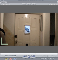
After registration and greetings Sara instructed us all step-by-step through the process of "scratch disks".
i directed the cursor to the top left of the page, then clicked on the icon "final cut pro" then "system settings" then "set scratch disk" after this i made a document file entitled with my name. This was done so i can save and access my work with complete and utter ease.
previously we had all done our rough cuts on our short films so this made the whole process run more smoothly and easily. As our "deadline" was in less then a week. After we had all been instructed on how to make minor adjustments to our 'films'. we where all taught and advised to check through our film once more then add Audio clips of our choice if we so wished or felt it appropriate.
lots of us wanted to produce our own audio clips and embed it onto our films but we then had to think logically and this would not have been possible for it wouldn't be complete to a substantial standard in the time frame given. so instead some of the class chose to either use one from a different source and others chose to leave the sounding that was already on the film as it was and possibly alter it slightly.
Like for instance in my film, originally there was numerous amounts of times when i could here one of the members of crew informing us of when the camera was ready for filming by shouting "action"or "rolling" etc. So in some cases i had just found it easier to just crop down the clip to parts of the clip that was most vital, although in other cases it was left to further alterations to then take effect.
i have uploaded images of my print screenings to illustrate the process of modifications made to my film...

this print screen was taken of part of my 'timeline', this was supposed to show the outcome of when i had decreased the fractions of the duration of this particular shot. i had done this because Jake (the love sick main protagonist) had ran down the stairs to show that no matter where he went he still could not escape his thoughts of Kate (the dead girlfriend).
when this was shot Jake had ran down the stairs and touched the wall to the right, then on the second shot he had done the same thing again but then his hand was raised slightly higher then the previous shot.
so to alter this i had to then 'play around' with the shots until i was satisfied. which resulted in the first clip being decreased and the second clip not being altered at all and then it was nice, it flowed.

i hated the whole process of amending and rearranging the film clips and if i am quite honest because i was quite nervous. i think that it was more so of a fear of the unknown. When in doing so i found it difficult for i was limited when it came to using apple MAC's and now that i have successfully finished i am happy to know that i have in actual fact completed my work to a satisfactory standard. for what was my first time in doing rough cuts, amending them then converting them in to a short film.
some of clips taken where taken from particular angles because we wanted to have a nice though creative and effective on the filming. At first we as a group wasn't too sure how we would go about this, we drew up story boards and planned our process thoroughly.
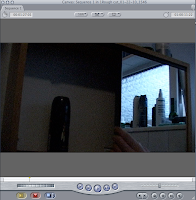
this is a clip of our main protagonist, he was starting his day by freshening up and getting ready in his bathroom. the objective for this was to capture Jake applying his deodorant. firstly you can see Jake opening the cabinet.
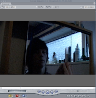
this was the image of Jake taking the can of deodorant from the cabinet...
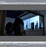
so then finally we had the ending of this "scene" with Kate appearing from behind him in the reflection of the mirror. this was done to help illustrate further more the fact that he is love sick and even in everyday life and normal daily procedures that he cannot escape his thoughts, feelings and even seeing Kate.
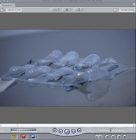
that's why we shot clips like these, so then we could add them if we so wished and this allowed room for flexibility, time and detail. i feel that these clips helped to make the audience think or become more involved, it drew them in further and if they where attentive then they would understand the depth of this.
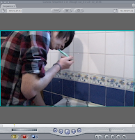
seeing this (Kate in the mirror) it shook jake up and his reaction was to run... this next clip shows jake not just leaving the room but the premesses completely.
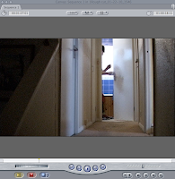
jake runs down the stairs,
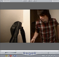
grabs his coat and heads out the front door.
As this post will no-longer allow me upload images onto this post the following will souly
Friday, 15 January 2010
jo saunders; FILM
lighting,
i feel that this was vital in the production of this trailer because this really did portray the theme, mood and genre of this film / movie
Birds eye view,
i liked this part of the trailer because it instantly drew me in as the viewer and made me feel as though i was there, right then.
Cropped Clips,
this kept my attention, i felt as though i didn't want to look away because i may miss something. it was emotional yet it still had action to it
Pan shot in office & close ups,
this showed the seriousness of the moment, it was as if everything was hanging on the thread of this moment / decision that needed to be made by all the staff members that appeared to be part of some high assosciation, government or commitee
Birds eye view of helicopter,
the rush needed for this moment was captured,
over the sholder (hug and the kiss),
the moment n this scene was capured so wonderfully... i became tearful at this moment beacuse the husband and wife embraced a deep meaningful hug before the husband leaft to then go and rescue there child, and there was a possibility that the husband may not make it back alive let alone save their child
Dolly / low-angle shot.
this was when the water gusshed towards the doors of what seemed to be the public library, this was closterphobic! because iot looked as though it can towards me!!.. i felt enclosed, vunerable, and hopeless although i was only watching it on the OHP screen and still sat in my seat.
jadine watkis
WAT09111520
[back date: 18-09-09]
jo saunders; FILM
Zooming in,
this is done in the first few seconds of the trailer, zooming of what is meant to seem to us as the audience some of the most crucial or viatl moments of the film / movie... still images of faces and locations, moreso the main protagonist (the father) and his family.
fade into black,
this happened after what appeared to be either the mans wife or girlfriend had an distute which resulted in the female character walking out.
three quarter shot,
the main protagonist and young child are left just stood there in silence,
panning,
this happened to fully portray the change of mood, location and scenery.
snap shots of scenery...
this showed an old decreped building, beautiful landmarks / views mostly of open spaces, and natural atmophere. to me all this showed a level of content aslmost happiness for this family...
inverting of colours,
comfirmation of the above...
Birds eye view into pan-shot
this is the end of the trailer, this pracrtically wraps up the whole storyline of the movie / film quite neetly. the begining of the film being seemingly drepressing, with a family of drowntroden hopes, low if any optimism and not much of a nuclear assumed touch and closeness... but by the end of this trailer its like, all, any and every hope and dream is possible and can be achieved.
jadine watkis
WAT09111520
[back date: 18-09-09]
Saturday, 9 January 2010
Edward ScissorHands
The plot of the movie is quite comical and shows the social norm for the 1950's what with the street of never ending terrace houses and the nosey neighbours and bright colours. This makes me think of 'The Simpson's'. The audios clips played a significant part in the movie. when there was clips of all the families and neighbours the music was bubbly, cheerful, up beat with a nice constant tempo. The genres perceived in this movie where Drama what with the over egzaderation and excitment, Comedy Fantasy the ever so perfect and happy family lifestyle and Romance.
This leads me on nicely to then discuss the dynamics of the family life in comparison to Edward. When Edwards' character was being introduced into the movie the lighting and colours where minimal. This made it seem eary, scary, and made me as a viewer curious to know what lead up those stairs, who or what was it stood in the corner of the attic and why was it there?
i like the way the director Tim Burton, used all the scenery to his advantage, using both side of the spectrum played them off against one another but then brung it together so that it became a symphony of movie history. not just because i admire this movie and have watched it more then twice, i like the way that even though slight fear comes across the viewers because of Edwards' appearance but the curiosity subsides that and makes them continue to watch the movie.
This is my opinion is a paradigm sub-cross genre movies. Pegg bogs, the local 'Avon' lady leaves the "oh so sweet" suburben area and makes her last stop at the mansion and the top of a long bendy winding trail that leads up to her discovery of Edward. Edward was the result of an great inventor progress he is "almost human" but he doesn't get to finish his "project"for he dies.
At first Edward appears dangerous, but instead he is a sincere gentle being. After Pegg Bogs invites him not just into her car but to her home and neighbourhood. Edwards life then changes for both the better and the worse.
please view the screenplay for this movie...
|
| http://www.imdb.com/video/screenplay/vi3651404057
|
Friday, 8 January 2010
Gothic Film shooting
Finally in a session with Jo Saunders we were all asked to put our visuals from the storyboards that were made into order from the filming that had been done. Firstly on the storyboard was a mid-shot of KATE lead in the bath the audio for this clip would have been water running, and the duration for this clip would have been 10secs. Although that clip went along well and I was so chuffed with myself! Because I had done that bit then I started perking up thinking yeah, no problems this will be fine.
The next three clips where supposed to be of JAKE in the bathroom he would slide open the bathroom cabinet door to retrieve his toothbrush, when he had finished doing so and slid-close the bathroom cabinet door their Kate would appear. This separate scene would have lasted for the duration of 30secs (approx) but I couldn't find the film to edit the clips and import them into the rough cut.
As the main protagonist was JAKE playing the part of a love sick boyfriend of a dead girlfriend who died because she committed suicide. a lot of shots were taken so then we had a variety to then chose and refuse from when it came to making out rough cut and final cut.
Doing this took up a lot of time because we then decided to use different camera angles and time frames although we wound up mostly using mid-shots and long-shots. We wanted to used more filming to annotate the story line as opposed to JAKE or KATE speaking. we wanted the film to be self-explanatory this also meant that we had to take the lighting and the audio clips that we were going to use into serious consideration.
A mid-shot was used in the graveyard scene to add extra authenticity, and make it more dramatic, we then used a considerable amount of time on this scene instead of using just a snippet or snap-shot. nearer the end of the film we really brought together the full story because from the beginning not everything is clear but by the end of the film all the pieces of the puzzle fit into place. the last three shot conclude of JAKE no-longer being able to cope and he then takes an overdose.
i feel that this is a smooth modern cut of a Romeo and Juliet love sick story. although it is quite short and sweet the point, subject, and imagery has been done so the purpose has been put across clearly.
jadine. <3
Thursday, 7 January 2010
Blade Runner Evaluation
Rick Deckard is the main protagonist in the movie for he is the LAPD's Blade Runner. He patrolled the seemingly never ending streets and sifts out the 'replicants'. these are mechanical made humans built by an obsessed elderly man. In Blade Runners' plot summary ity is that the elderly man was "in retirement" although to me this was not made clear. This man developed the technology to create them with "fixed lifespans". the scenery is also descried to be "a steel and micro-chip jungle of the 21st century". Ridley Scott (the director) the opening sequence was inspired by his memories of steel works in the north-east of England where he grow up.
In my opinion this film really does draw in its audience and question the concept of life, humanity and reality even. for this film to have been made at such a time its perfect and still quite practically untouchable.
At first admittedly i didn't seem too interested because of it's dark, bleak and murky scenery what with the deliberate lack of lighting. Although because of this it was a great effect. As the movie proceeded my opinion changed.
jadine. <3
Friday, 25 September 2009
In the first 10 Seconds, this future short shot clip copied and embed from youtube to my Blogger profile introduces itself. by panning with the title in the top centre of the screen the "dissolves" as the main protagonist appears.
The setting is in a "regular office", dimmed lighting, middle aged man looking quite frustrated, late evening hours on his own. Then a close-up to his face. there is then a close up into when he clicks(what i assume to be the "print" button), back to the facial close-up and then he repeatedly presses the button once again. In frustration he then kicks the machinery and then one sheet of paper is printed with a black hole in the centre, hence the title "The Black Hole".
Weather Induction Project: Evalution
The second shot didn't work as well because the theme behind it was "rain" although there was no rain, so instead the shot was taken in an alley to add slight darkness which still didn't quite for fill our plan. Our attempted choice of location for this was a dark shaded alleyway, which then resulted in a contradiction because the weather was sunny. We(charlie, Abi and i) thought this would be suitable as it was a sunny day and it was very hard to portray the rain, evidently using an umbrella as not enough! =D
Shot three was a tree taken at a low-angle point. The sun shined through which then gave a great effect of summer. The breeze made the leaves sway, almost dance like, which portrayed te weather to be sunny yet with a mild wind. the tree was "perfect" for our shot as it had lots of branches, it was in full bloom almost, not bare so when the sun shined through it looked so nice and calming...
A time limit was given so planning and preparation for this was not in our best interest. If i was personally given this project to do i would put planning and preparation into practise. Although if this project was to be given to us as a group once again we wold plan our three shots which would guarantee a better outcome, because there would be more of a chance of having a range of weather conditions. This would have been more sufficient as accessories such as clothing, techniques such as facial exspessions and the body language would be more better.
However, as a team(me, Abi and Charlie) i think that we worked sufficiently, co-operated and communicated frequentlyand each incorporated our ideas into our(short) film.
JADINE.<3
